


Problem statement
The existing marketing website no longer reflected the company’s evolving brand direction or target audience. With a new focus on enterprise clients, the website needed to convey a more premium and exclusive identity while supporting scalability for future growth. Additionally, the previous Webflow setup limited design flexibility and content management efficiency, prompting the decision to migrate to Framer.
Audience
As part of the brand evolution, the company redefined its Ideal Customer Profile (ICP) to focus on mid-market B2B SaaS companies (50–500 employees, $5M–$500M in revenue), and to a lesser extent, lower enterprise organizations (up to 2,000 employees). These businesses shared similar goals — building strong customer communities, improving engagement, and creating scalable customer communication channels — but with increasing emphasis on security, customization, and brand alignment as they grew.
The new audience primarily spans North America (especially the US), the UK, and Europe, with about 70% of existing customers based in the US. This shift required the marketing website to appeal to a more mature, enterprise-aware buyer persona — professionals in marketing, customer experience, or product roles who value credibility, strategic value, and long-term scalability over quick setup.
These companies typically look for solutions that:
Foster customer-to-customer interaction — brands that “own the town square” of their user community.
Offer marketing and support teams new engagement channels, both 1:many and 1:1, for customers at scale.
The redesign needed to visually and structurally communicate trust, sophistication, and flexibility, aligning the brand experience with the expectations of enterprise-ready SaaS companies like ScreenCloud, FullBay, FlutterFlow, Torq, and Ceros — all representative of the new ICP.
Key Competitors
To ensure the redesign aligned with the expectations of enterprise and mid-market SaaS audiences, I conducted a competitive analysis of leading community and engagement platforms. The goal was to understand how established players communicate trust, value, and scalability through their marketing websites — and identify opportunities to differentiate.
 | Circle Circle positions itself as a sleek, modern community platform for creators and small-to-mid-sized businesses. Its website focuses heavily on clarity and ease of use, with clean visuals and conversational messaging. While the experience feels accessible and friendly, it lacks the enterprise tone and depth expected by larger SaaS buyers. This helped reinforce the need for a design that feels both premium and approachable — balancing aesthetic minimalism with strategic credibility. |
 | Hivebrite
|
 | Khoros Khoros targets large enterprises with a broad suite of community and engagement tools. Its website conveys scale and maturity but leans heavily into complex information architecture and dense content. The site feels powerful but somewhat overwhelming. This analysis highlighted the opportunity to simplify — to communicate enterprise capability without complexity, using clear visual hierarchy and intentional storytelling. |
Success Metrics
The redesign and migration were measured not only by brand alignment and workflow improvements but also by measurable conversion gains. Over the first three months following launch, the new website showed clear performance increases across key funnel metrics.
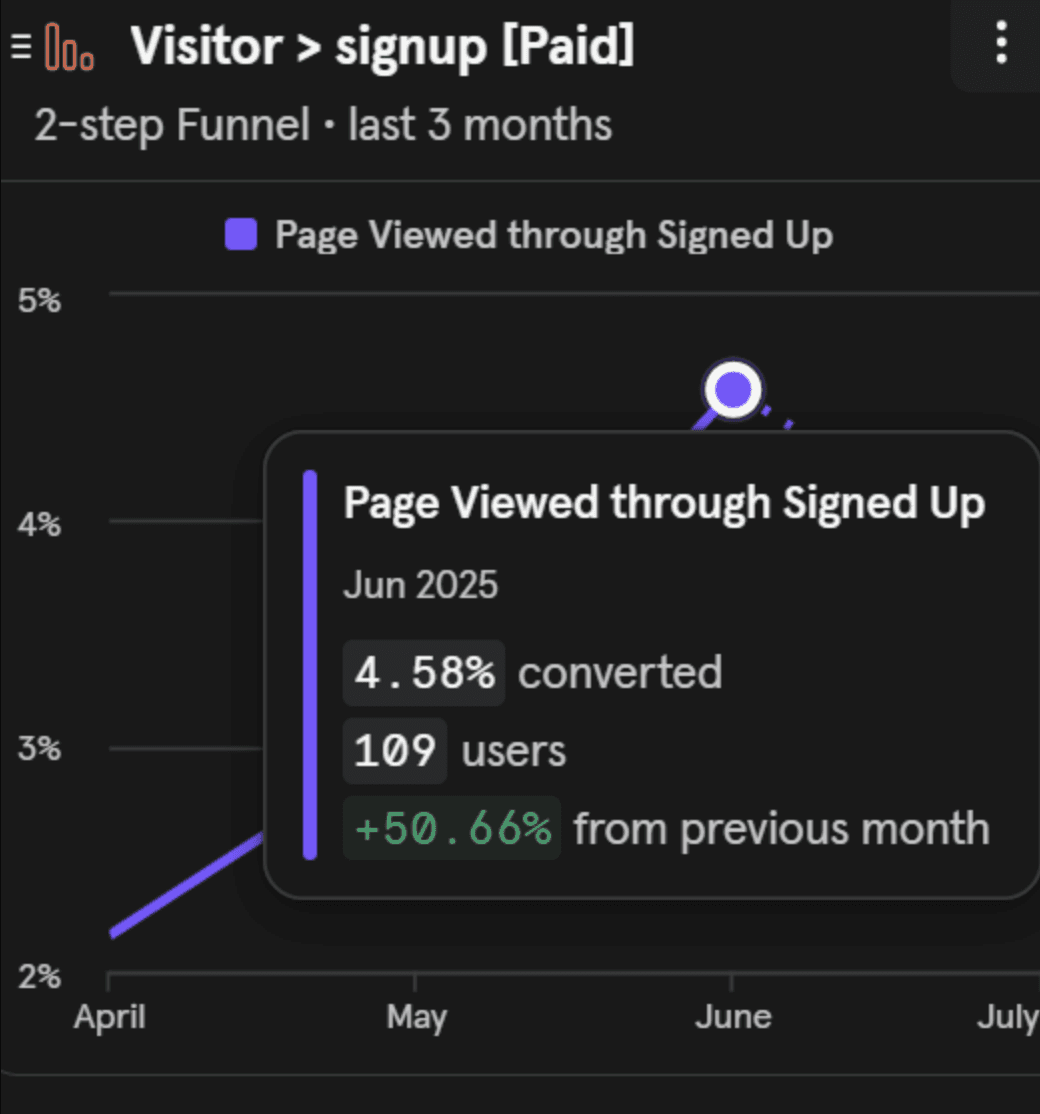 | Improved Paid Signup Conversion
|
Key insight:
The redesigned landing pages and streamlined signup flow improved the overall experience and reduced friction, resulting in higher-quality conversions.
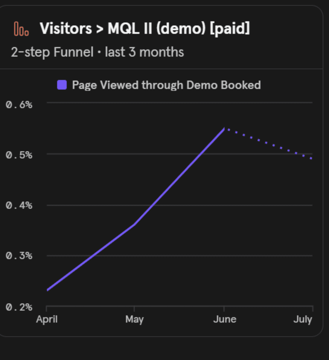 | Increased Demo Bookings (MQL II)
|
Key insight:
Simplified navigation, stronger product storytelling, and clearer segmentation between use cases led to higher-quality demo requests from the target ICP.
Enhanced Marketing Agility
|